
Data Vis – DGHS 1/26/2021
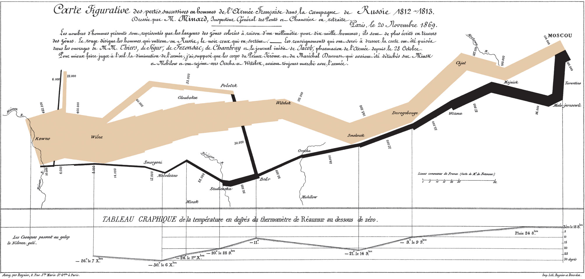
Minard’s chart displays six different types of information: geography, time, temperature, the direction of troop movement, and the number of troops remaining. The work is widely regarded as one of the best examples of data visualization. This fact is made more impressive when one considers that the map dates back to the mid 1800s. The most innovative piece of the work is the width of the lines, which correlates with the number of men remaining in the army, one millimeter to 10,000 men.
I enjoyed Lin’s lecture about data visualization and effectively graphing data. I thought that some of the stuff she said about narrowing down which data is important to show enough that the graphic can actually be easily understood was really important, as I frequently have problems making myself remove any of the data from a data set. I also found the Google Sheets tutorials fairly useful.